Brief
Concept
Target audience
Creating a period brand in China that addresses the period taboo.
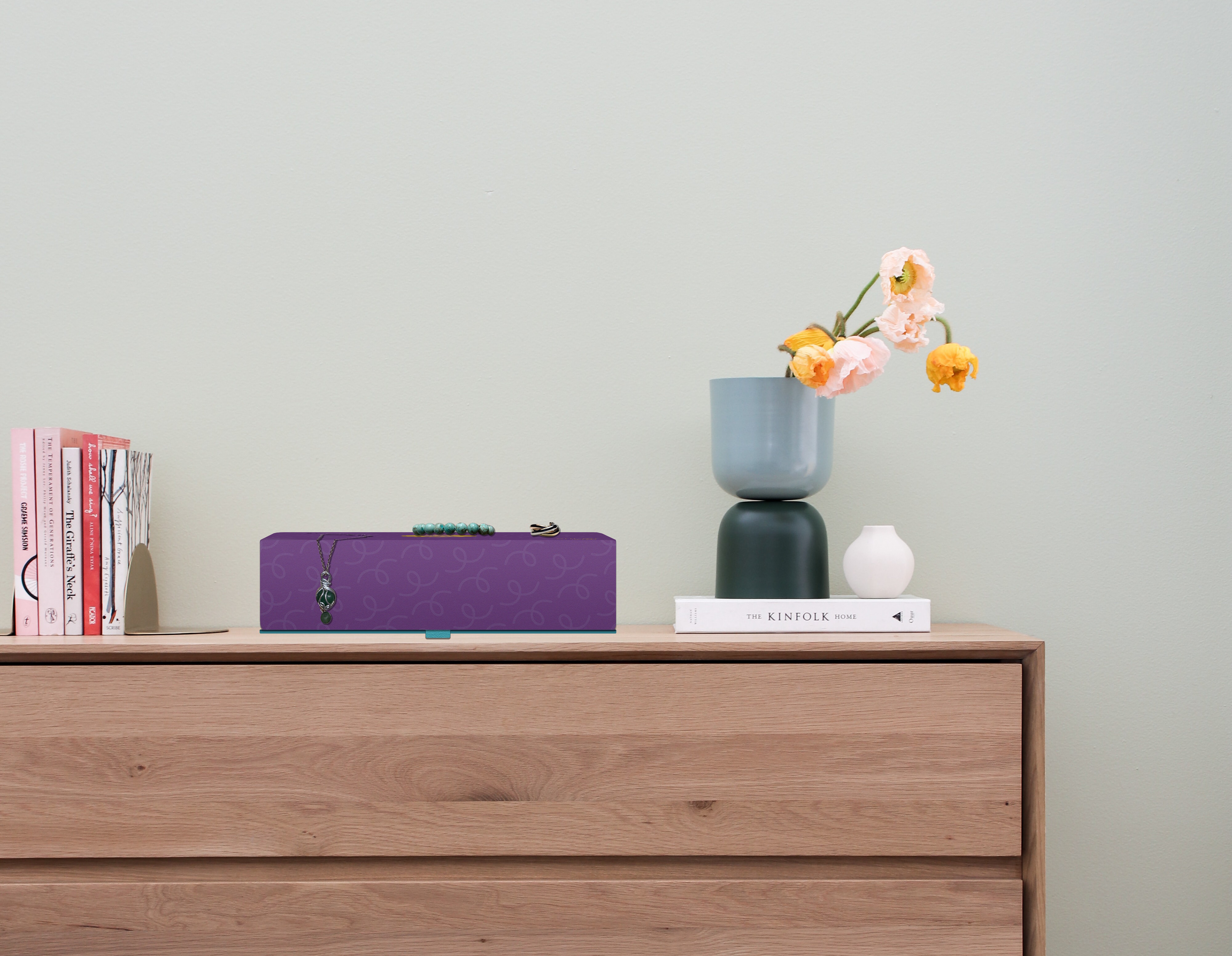
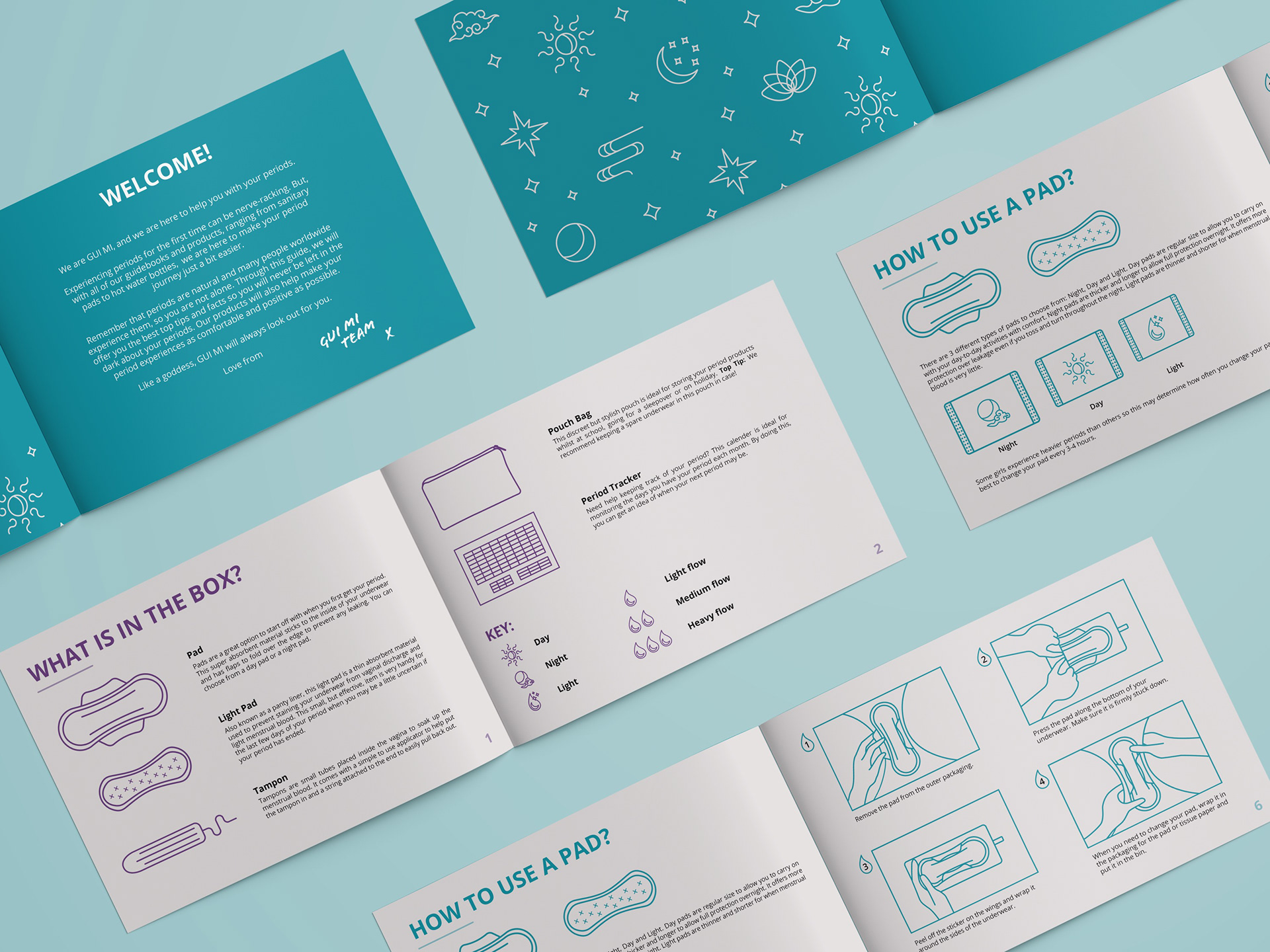
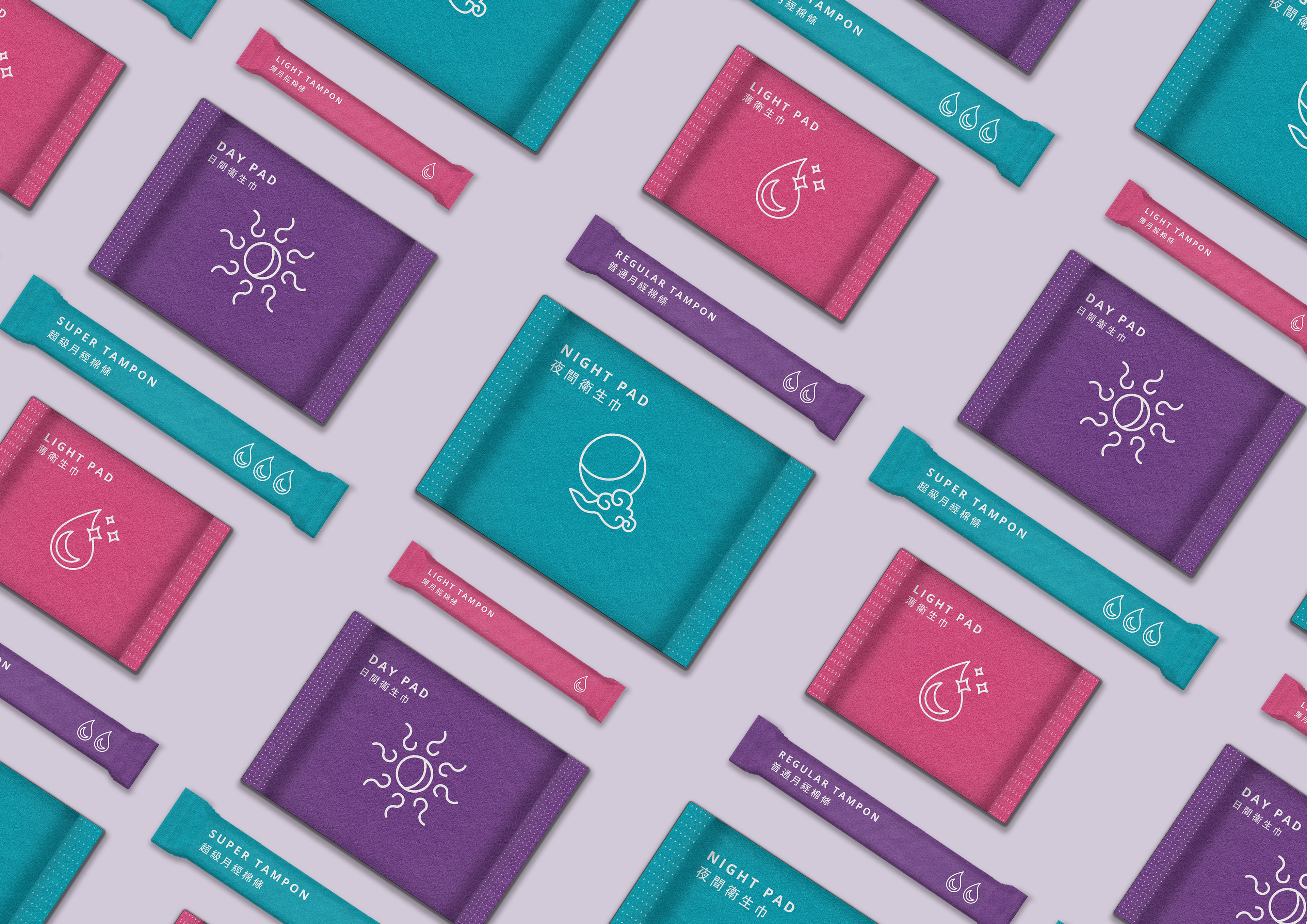
A new, progressive period brand aiming to comfort young girls during their periods. GUI MI translates to a girl’s best friend in Chinese. It shows how the audience should view the brand as its friend that offers them advice, guidance and support when needed. The brand encourages young people to talk more openly about menstruation and educates them on menstrual health to tackle the period taboo. The GUI MI period box is one of GUI MI’s core products, created to provide young girls with the period products and knowledge they need to support them at the start of their period journey.
The GUI MI period box is aimed at Chinese girls aged between 11-13 years old who have just started their periods. Due to the negative associations surrounding menstruation, young girls tend to be scared and anxious about getting their first period. The brand provides all resources needed, in an accessible and friendly way, to make the start of their period journey as smooth as possible.
The Brand Logo
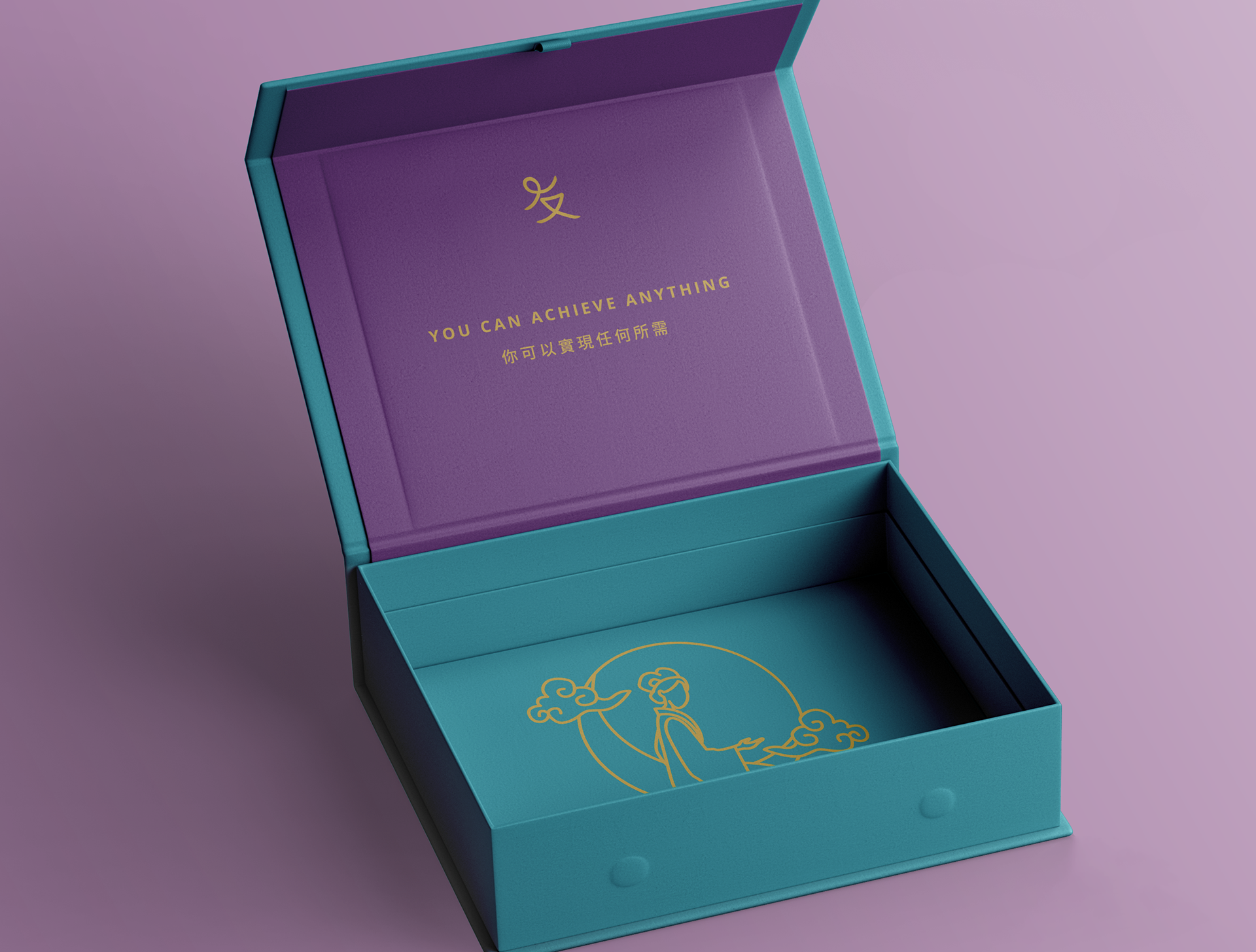
The symbol in the GUI MI logo has multiple meanings. Firstly, it is an abstracted version of the character for friendship in Chinese, 友. It encourages the audience to see their periods as their friend rather than an enemy.
Secondly, it resembles a young girl running or dancing. This symbol, therefore, represents empowerment for young girls. It is friendly, subtle and welcoming.
The Goddess Imagery
The goddess illustration that appears at the bottom of the box is a depiction of Chang’e, the goddess of the moon. Chang’e is known for her beauty and loveliness. She is celebrated during the Mid-Autumn Festival, where people gift each other mooncakes in her honour.
This illustration provides periods with a positive association. It also serves as a protector to look over young girls during the sometimes challenging stages of menstruation. The audience discovers this illustration last when unfolding and emptying the box.
Colour Theory
The primary colour purple symbolises love, strength and spiritual awareness in Chinese culture. This represents empowering young girls. The primary colour turquoise symbolises bringing positive meaning, healing, trust and long life. This promotes the positivity and trustworthiness of the brand. The other colours are the secondary colours that contribute to the brand.


